PROJECT OVERVIEW
This group project assessed the usability and desirability of the YouTube Music App to make recommendations based on our findings. I took the lead in writing our script, brainstormed how the interview space should be organized, provided phone stands to assist with recording, transcribed our interviews, and synthesized user feedback independently through thematic analysis.
TOOLS
- Figma
- Zoom
- Google Forms
- Miro
METHODS
- Ethnographic Study
- User Interviews
- Competitive Analysis
- Secondary Research
- Surveys
- Moderated Usability Study
- Cognitive Walkthrough
- Heuristic Evaluation
- Thematic Analysis
- Persona Development
- Customer Journey Mapping
- Task Analysis
- Statistical Analysis
KEY RESULTS
- Actionable insights on music streaming user behavior.
Identified bugs.
Identified a hero feature that could draw users to YTM.
Actionable recommendations
for: decreasing information density; algorithmic improvements; leveraging bundling YTM Premium with YouTube Premium to overcome the impact of platform familiarity.
ARTIFACT ANALYSIS
YouTube Music (YTM) is a music streaming platform that has both paid and free versions. The free version is superior to competitors in that it allows users to fast-forward within media, and there is a robust selection or international music. Online discourse about the app includes complaints about it not being included in a bundle with YouTube Premium, and complaints about the efficacy of it's "Radio" algorithm. It's UI is superior, offering a black backdrop and prioritizing soothing colors to encourage users to relax and enjoy their experience. Following industry standards, the music on this app is highly customizable and in addition to adjusting music recommendations in response to users' "likes" and "dislikes" or songs, YTM pulls suggestions from users' preferences on YouTube.
View Artifact Analysis
RECRUITMENT AND SCREENING
Our target demographic for this project was college students between the ages of 16 and 30 who actively used music streaming services, but had not yet used YouTube music. In order to understand the effectiveness of the YouTube Music algorithm, we selected for participants who were active YouTube users; we wanted to assess how well the algorithm predicted what a user would enjoy based on their YouTube history. We sought out participants who hadn't used the application before because we wanted to capture the experience of new YouTube Music users. We recruited among our peers, sending them a screening survey to ensure they met our participation criteria.
View Screening Survey
USABILITY STUDY PREPARATION
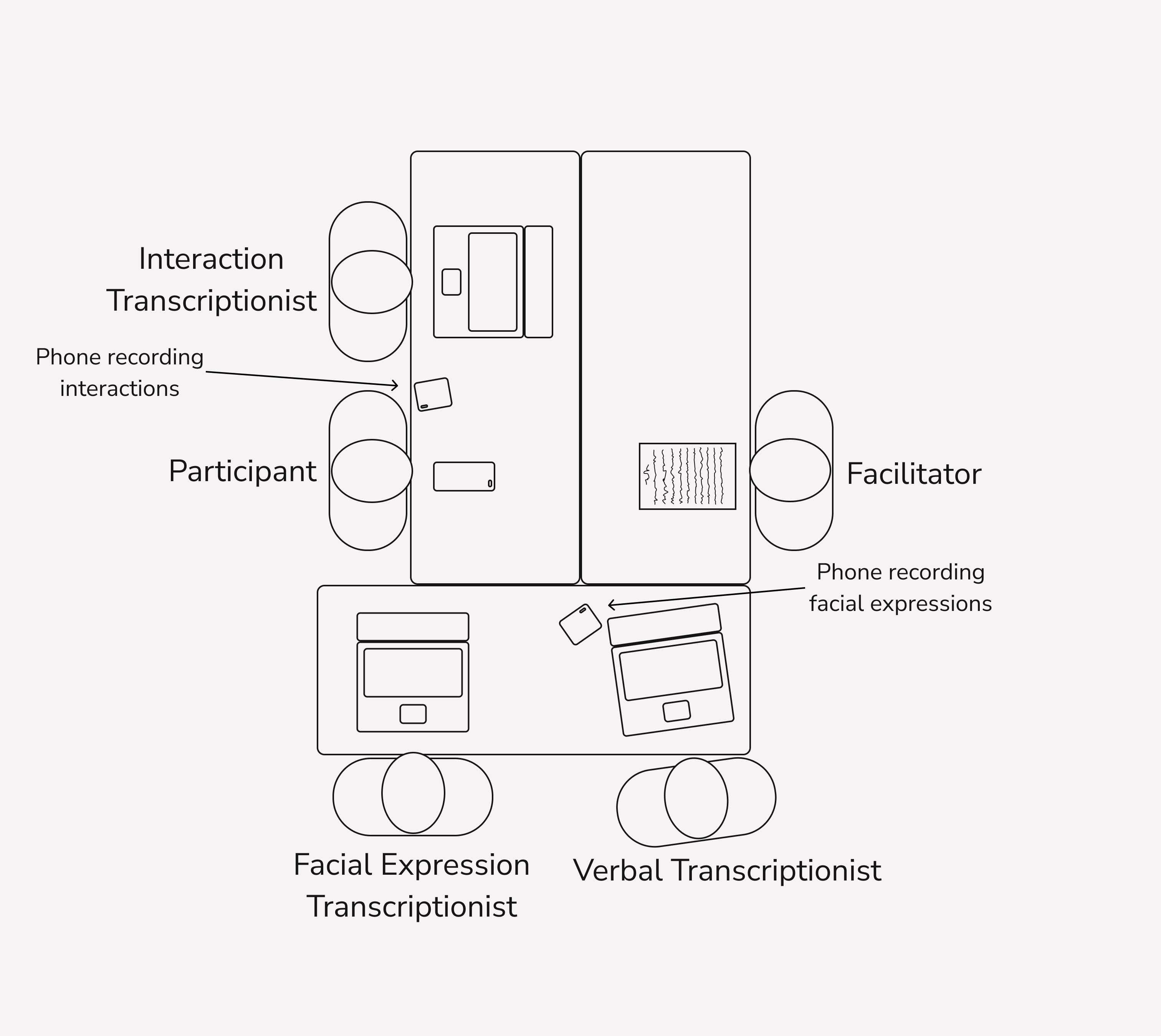
My team reserved a conference room in Odegaard Library on campus. We arrived an hour before our first participant to arrange the room, and to perform a run-through on our physical set-up. Our facilitator had a print-out of the script we had developed together.
ROOM ARRANGEMENT
In order to understand our participants' stated and revealed preferences, we wanted to track a variety of responses, from screen navigation to facial expressions to verbal feedback. The team member tracking navigation behaviors was seated closest to the user, to capture their navigating activities. The facial expression transcriptionist was seated a similar distance so she could better see users' expressions. I was seated such that my recordings would show users' faces in 3/4 profile, providing lateral and sagittal information. The facilitator sat directly across from participants to focus the user's attention on the requests at hand, and to focus less attention on other team members. Although we had all planned to take notes on our laptops, we wanted to create back-up resources for our data. My role was to ensure facial expression recordings were successfully captured on my phone, and to transcribe verbal feedback.
SCRIPT
Preliminary Questions
We confirmed that our participants were part of our target demographic and asked them about their current music streaming habits and preferences.
Tasks
Homepage: find a music video to play, find a song recommendation, navigate to the "charts" menu, and create a playlist using the "Your Music Tuner" feature.
Explore Page: search by genre, add an album to the user's library, create and share a playlist. In order to test the effectiveness of the genre typing/recommendation algorithm, we asked users about the recommendations provided by the app.
Music Player: look up artist information, navigate to the lyrics page.
Post-Task Questionnaire
This included such questions as:
On a scale of 1-10, how likely are you to use YouTube Music?
Can you tell me about a YTM feature you would like to see used by your primary streaming platform?
Did you enjoy YTM more than you enjoyed your primary streaming platform? Why or why not?
View Script
THEMATIC ANALYSIS
After conducting usability studies, I performed a thematic analysis in Miro using participants' self-narrated behaviors and responses to questions.
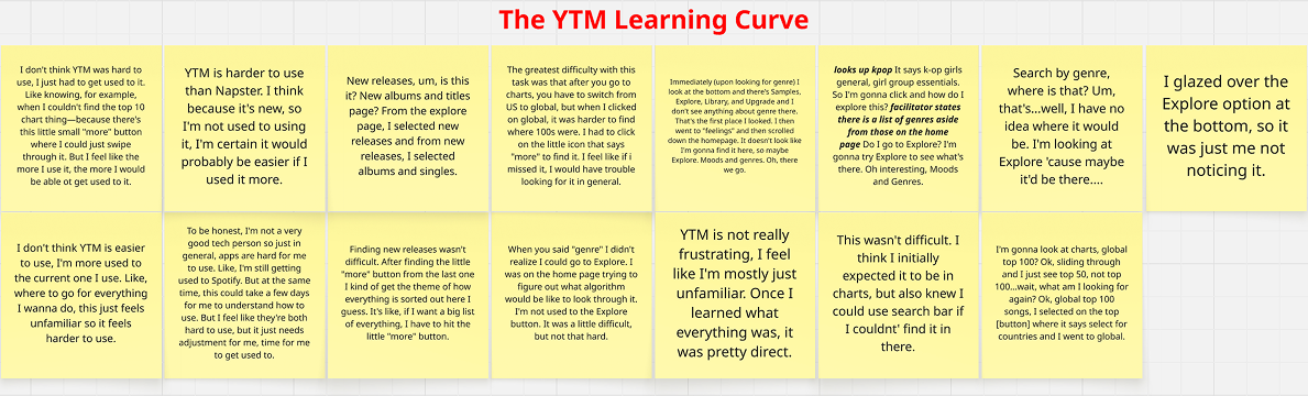
The YTM Learning Curve
These quotes demonstrate confusion while using YouTube music and may indicate there's a learning curve to using YouTube Music.
"Search by genre, where is that? Um, that's...well, I have no idea where it would be. I'm looking at Explore 'cause maybe it'd be there...."
Adequate Experience/May Return
These quotes demonstrate a tentative openness to using the app again. They describe a positive attitude towards the app that ultimately leans neutral.
"I'm satisfied with the recommendations, they're good songs I guess. I would listen to some of these."
No, thanks
These quotes demonstrate a disinterest in YTM's features.
"I probably wouldn't use this feature again. I don't really look at music through genre, I just look at music through auto-generated playlists and go by songs."
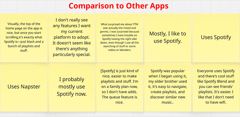
Comparison to Other Apps
These quotes compare YTM to other apps or what other apps participants use, and why. Most participants use Spotify.
"Visually, the top of the home page on the app is nice, but once you start scrolling, it's exactly what Spotify is—just black and a bunch of playlists and stuff."
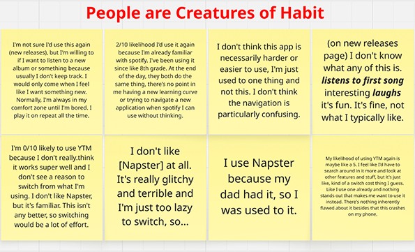
People are Creatures of Habit
These quotes highlight how our participants strongly prefer to continue using the same app and listening to the same kinds of music.
"I don't like Napster, but it's familiar. This isn't any better, so switching would be a lot of effort."
Tasks That are Easy
This theme describes tasks that were visibly easy for users to complete, and tasks that users stated were easy to complete.
"This wasn't difficult, that one made sense."
Unsuccessful
This theme includes quotes that communicate a task was not able to be completed, either because of user error or because of a bug that we discovered within a feature.
"I'm not happy with music tuner because it didn't work"
YTM Pushes Volume and Options
These quotes detail how the volume of content and the volume of data available to YTM via YouTube, is perceived by users.
"It's really cluttered."
"There's a lot of stuff."
Revealed Confusion
These quotes highlight a contrast between a user's reported and revealed levels of confusion.
"I think it was pretty simple. I think the thing is it's missing from where it should be. I assumed 'top' would be in Charts."
Yes, please!
These quotes indicate an openness or enthusiasm about a feature.
"There are a lot of genres I didn't know about, which is really. interesting and cool. I like how they have colors for each mood, too, to have the 'vibe' or 'aura' of the playlist."
Meeting Expectations
This theme is for quotes that indicate expectations have been met and that YTM's features and algorithms are performing in a way that meets industry standards.
"The genre options seem standard."
"The recommendations were pretty accurate."
iPhones galore
This theme covers what kind of phones participants used for the study. This is notable because a bug was uncovered that may not have been present on non-iPhones.
"Wait, what was I even looking for?"
There were several instances over the course of our studies in which participants spent so much effort navigating the app in order to complete a task, that they forgot what they were doing. This theme details those moments.
"...back to Explore...maybe Charts...Ah, top videos, top artist! Wait, what was I looking for?" "Global top 100"
The Eternal Home Page
Because there were similar explicit statements made about the volume of information on the home page specifically—and because the home page had more than twenty distinct sections at the time, which was unusual—I created a theme for quotes about the long home page.
"It's just, the home page was a lot."
Yuck
This theme includes a unique quote that expressed an active dislike of a UI choice. This specific participant had been enthusiastic about the functionalities of the YTM app and had used many softening words throughout the study to downplay the negative impact of confusing design choices, so this quote was notable.
"They're outdated, like old instagram millennial type of thing. They all look like computer backgrounds. It's not pleasing to me."
FINDINGS
100% of participants chose music streaming apps based on familiarity and/or peer use. Most participants enjoyed various features on Spotify.
75% of users had difficulty searching for music by genre. Offerings met expectations, but most users were disinterested in this feature.
Users focused on finding features on the home page, which featured more than 20 sections at the time of testing.
Users struggled to search for the top one hundred songs globally because the feature was hard to find and they didn't anticipate having to use a drop-down menu to adjust the number of songs and locale.
There were issues with the search function on the app; it often failed to retrieve what users were searching for.
Users succeeded in finding new albums and singles, but were disinterested in doing so because this wasn't their preferred method of discovering new music.
Reactions to My Music Tuner were the mostly positive, despite issues. This feature was difficult to find, confusing to set up, and there was a bug that prevented the creation of a station. Recommended music to base the station off of seemed random. However, users had begun to express enthusiasm about the station as they figured out what the various terms—familiar, discover, blend—meant, and later expressed that they might have been excited about this feature, had it worked properly.
The average reported likelihood of using YTM, from 1-10, was 3. Users noted the difficulty of recreating their Spotify preferences in YTM, a lack of compelling features, and comfort with their current platform.
When asked if there were any surprising features about the app, half of the users mentioned the My Music Tuner feature.
Only one user stated there was a feature on YTM they would like to see adopted by their platform of choice, and that was Moods And Moments because of it's expressive use of color.
Most users enjoyed the use of color at the top of the home page.
Users generally found the layout to be too high-contrast and cluttered.
Users found music recommendations to be mostly relevant.
RECOMMENDATIONS
- Since the driving force for selecting a music streaming platform is popularity/familiarity and since online users in the preliminary analysis shared that YTM should be bundled with YT Premium, I recommend including YTM with Premium to reduce barriers to entry and build a larger user base in order to create popularity and familiarity.
- Users complained the home page is too information-dense. I recommend either removing the 5 least popular features, or grouping similar features into carousels.
- The use of “More” drop-down menus is not intuitive. I suspect this drop-down was used because there was no sensible way to present a vertical list of clickable settings. Keeping that in mind, an alternative that would improve discoverability would be to include an interaction where the "more" drop-down menu shows a radial pulse effect for 2 seconds upon initial page load.
- The search functionality needs improvement. Users expressed surprise at their inability to use Search to find relevant results. I recommend improving the search algorithm to better match user queries with relevant content.
- Participants were generally satisfied with music suggestions. However, there was room for improvement—specifically, two users were recommended Cocomelon content. If the YTM algorithm boosts certain artists as the result of new releases or location-based trends, I recommend recalibrating how heavily those factors are weighted in the music recommendation algorithm.
- Users responded positively to the My Music Tuner. Despite the feature not working properly due to a bug, they still recalled this feature at the end of their interviews and expressed interest in it. I recommend prioritizing a fix for this bug and then featuring this functionality prominently in the app interface and in advertisements for YTM.
- Users generally enjoyed the visual design on the top of the home page and one enthusiastically praised the use of color in the Moods and Moments feature. Several users disliked the visual effect of seeing many album covers side-by-side. I recommend re-creating homepage-style visual designs on the other pages, and drawing inspiration from the Moods and Moments feature to create more visual harmony between albums. One possibility for creating visual harmony would be to create an algorithm that populates the icon for the artist with album art that’s visually aligned with neighboring images either in hue, tone, or saturation. A less computationally expensive solution would be adding a 15% saturation color filter over all the albums in a certain category could create a greater sense of visual harmony.
PROBLEM STATEMENT
How usable is the YouTube Music application, and why?


.png)